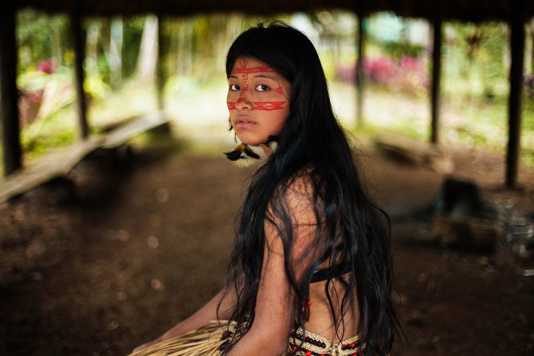
 This photo was taken by portrait photographer, Mihela Noroc. I enjoy this photo firstly, due tot he emotion. In her face it is clear to see her heritage and everyday life. Secondly the focus is nice and sharp, only on the photographer's key subject, which is the girl. She makes the background less distracting by blurring it out, bringing all of the viewers attention to the girl. Lastly it is just a beautiful shot, although it was probably staged, Mihela took her time to ask this girl and capture this beautiful image.
0 Comments
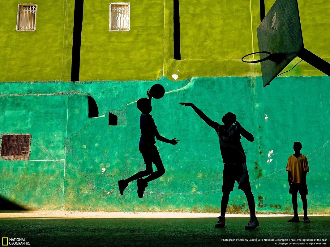 This photo was taken by Jeremy Lasky in Havana Cuba. This is a great photo because of the composition, in how the people in the photo are spread out. The background, and the people's shadows almost make the photo look like a painting. This is what gives the photo a greater sense or feeling of emotion, and fine art. Lastly, the photo is just overall an aesthetic photo.
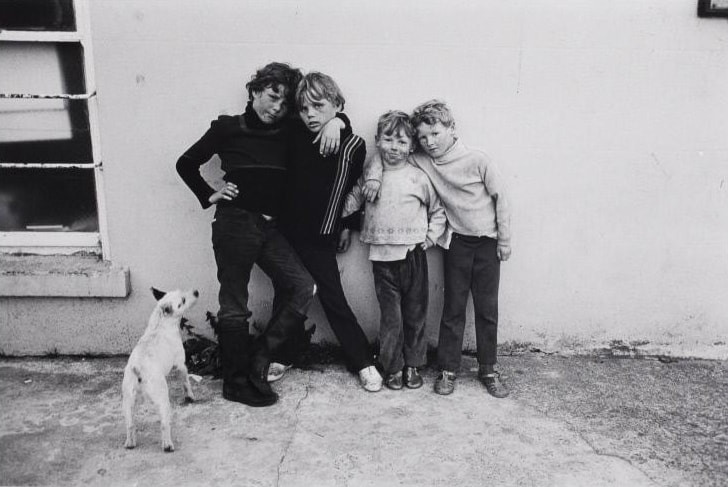 This photo was taken by documentary, candid, street photographer, Jill Freedman. This photo is fantastic because it has both max black and max white. The photo also shows emotion through the children hugging each other. I think the photo could have been better if she cropped the photo or panned over to the kids a but more, but other than that, it is an amazing photo.
 This is a photo that I took of some decaying flowers. I enjoy this photo because the focus is sharp, but also fuzzy and sets a mood or tone for the photograph. I also enjoy the composition because, the dead flowers, are mixed in with live flowers. Lastly the colors are nice and bright, where and when they are supposed to be.
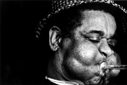 This photo was taken by documentary, street photographer Jill Freedman. I enjoy this photo because Jill Freedman was able to capture Mr. Dizzy whilst preforming his passion. You can see that emotion in this photo. Also, as a black and white photographer, she is able to capture max black in the background and max white in the highlights on his face. Overall one of my favorite photos I have seen come from a photographer of the week.
 This is a photo that I took my little sister after she threw a temper tantrum. I like this photo because of the emotion, in the photo, you can clearly see the tear stains on her cheek. I also enjoy how I cropped the photo, and how I was able to fit the small detail of her tears in there. I think I could have improved with the focus but, little kids move around so much. To be completely honest, I was lucky to have even gotten this shot.
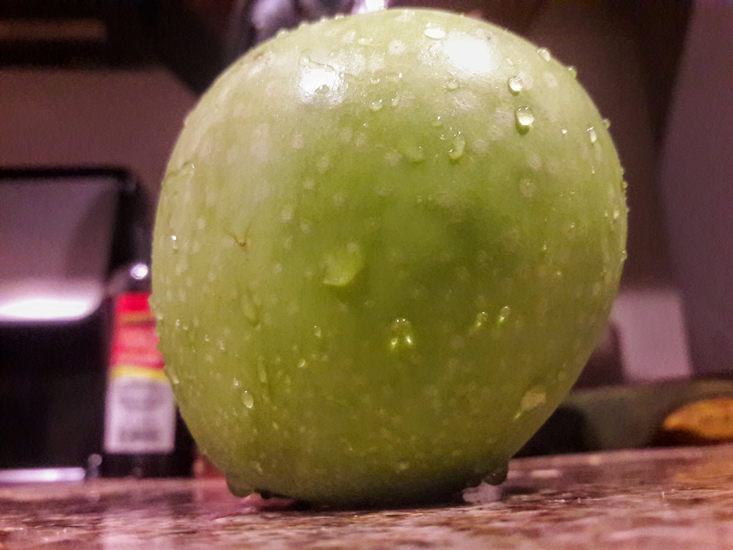 This is a photo I took of an apple this morning. I think the colors, and counter give the photo a comfortable feeling. However there are also a lot of things wrong with this photo. Number one, the focus is fuzzy, so it makes the whole image look questionable. Secondly the composition is off, it is too far to the right. Lastly, I feel as if I took a little more time, this could have been a way better photo.
 This is a Photoshop edit that I did of my brother. I enjoy it for the composition and the idea that I had. The color blue was a good choice, since he is a young boy. In addition the musical notes look dimensional and add depth to the photo. I think it could have been better if I added a few more things but, I have no idea what else I could add.
 This photo was taken by photographer, Henrik Knudsen. This photo is great because of the mood. The colors that he chose to highlight in the photo set a professional yet comfortable feeling. The focus is also very nice, and sharp. Lastly, the lines in the photo are straight. Because of the fact that all the lines are straight, it gives the photo a sense of maturity and professionalism.
I graded Bella, I gave her a 10/10 for her partner blog, and a 9/10 for her Artsfest.
|
PhotographerThis is Desirae's blog page. Archives
May 2018
Categories |
 RSS Feed
