 This photo was taken by me. It is a photo of a statue in my grandma's backyard. Overall, I really enjoy the composition of this image, as well as the lighting, and focus. To start off the composition is really strong, there is no distractions in this image, and your eye is drawn to the focus, the woman. Secondly the lighting, although it is natural, it lights up this statue perfectly, this then allows the viewer to see the full image in much clearer detail, as if they were there with the statue itself. Lastly, the focus, the focus is very nice, sharp, and strong. Therefore that's why I not only like, this photo, I love it.
0 Comments
 This photo was taken by me. There are many eye pleasing elements, however, there are some places where this image falls short. For example, the composition of this photo was a good start, but the focus of the image, and the rule of thirds do not apply to this piece. First off the focus is horrible, you can hardly make out the image on the electrical box. In addition to this the rule of thirds does not align with this photo, making it look less professional. Despite these factors, the lighting is pretty well done, although it is natural, it looks really well done.
 This photo was taken by Man Ray, a photographer who specialized in surrealism. This piece is nothing short of amazing. The lighting, as well as the composition and focus, really give this picture it's, muchness. The lighting is perfect, we are allowed to only see, half of this young woman's face. In addition to the focus, the focus is sharp, this allows us to see the woman's eyes and features perfectly. Lastly, the composition, the way Man Ray decided to place this woman, so that only half of her face was lit, is absolutely incredible, although he could have edited it, there is no doubt that is picture is gorgeous.
 This photo was taken by photographer Man Ray, who specializes in surrealism. The lighting in this piece is fantastic, although it is artificial, it brings together this piece in a sense that, these tears are not real, they are artificial, so perhaps just like the light. In addition the focus is remarkable, her eyes, nose, and fake tears pop out wonderfully, as well as beautifully. Overall a very eye catching piece.
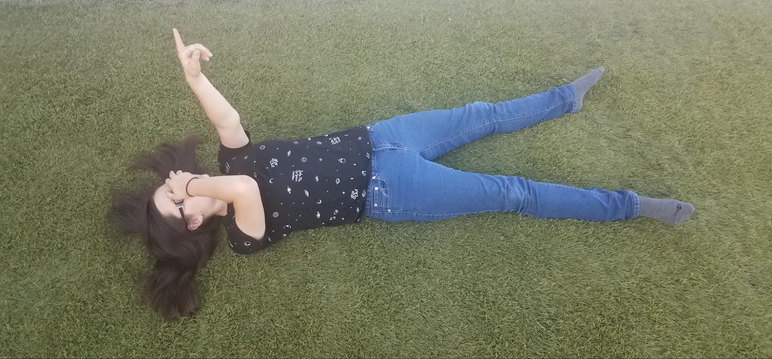 I took this photo of my sister in my grandma's front yard. I enjoy my idea and composition for this piece. I believe that I used the rule of thirds professionally. However, the focus on this image could have been sharper. As well as the lighting, I should have tried to have more natural light, or created a source of artificial lighting, just to get her clothes and skin tone to pop. Other than these problems, I believe that this image is both pleasing and well composed.
 This photo was taken by Deanna. I really enjoy the focus of the photo, as well as the colors. The focus is sharp, that lets the viewer see the crispness of the image. It really draws you in. In addition the colors are bright, the bright colors of the butterfly, really contrast with the colors of the fruits. The angle is also very pleasing to the eye, it actually looks as if you were seeing this for yourself. Overall, a great photo.
 This photo was taken by photographer, Brandon Stanton. This photo is really crisp and clean, due to the focus and how the background is blurred, this way you are only focusing on the person. The lighting in this photo is also great, it lights up this individual's face almost perfectly. The composition of this photo also plays a role into how it has turned out. The colors of this man's clothing is very bright, which contrast with his beard color. This bright color allows us to get a sense of this person's personality. Which personally I think, Brandon was trying to capture.
 I took this photo when I went to Imperial Beach with my grand parents. I really enjoy what I was trying to capture by taking this photo. However there area few things wrong with it, the angle number one, is very confusing and makes the whole image look askew. The second thing would be the background, the buildings in the background distract you from the main focus, which is the sign. Other than that the focus and lighting are pretty spot on, and looks okay.
|
PhotographerThis is Desirae's blog page. Archives
May 2018
Categories |
 RSS Feed
